Building a Brand
5 Logo Design Principles to
Elevate Your Brand
By: Bailey Thibodeaux // 11.17.2020

So… Here you are. Stuck looking at your computer screen with a great business idea trying to come up with a logo design that will scream professionalism and reveal all of your values, dreams, and visions for your brand. You have so many great ideas and want to convey those out through an effective and memorable logo. I get it. I’ve been there.
I always fall back on these 5 Logo Design Principles when developing logo designs. If you start using them, it will allow you to deliver your brand identity to others in a fresh, professional manner.
I want to preface this by saying that I did not reinvent the wheel here. Logo Design Principles have been around for ages. However, I have taken these principles and evolved them in a way that I find to be the most effective when developing a logo design.
Let’s get to it!
1. Simple
You have so many amazing ideas flowing in your head and developing with your business being born. You want to show all of these great ideas through your logo so that others can see how great your idea is, but don’t get too excited. I often see people designing logos that have a ton of information in them. They want to tell you when they were established, the 10 products/services they sell, their global mission, their favorite color, and their location. Heck, why not throw in grandma’s famous chicken and dumplings recipe while we’re at it?
While I admire the amount of thought and effort that goes behind the design of these logos, they are doing way too much. It’s almost like a girl putting on a full face of makeup, curling her hair, putting on Gucci Pants, and bringing a Prada purse to go sit out in a deer stand with a guy she likes at 4 am. She might look good upon first glance, but her perfume is scaring all the deer away. Whenever you are shoving all of this information into your logo, you’re scaring all of your customers away.
So, how do you fix this? You K.I.S.S. your logo. K.I.S.S. it as in:
KEEP IT STUPID SIMPLE.
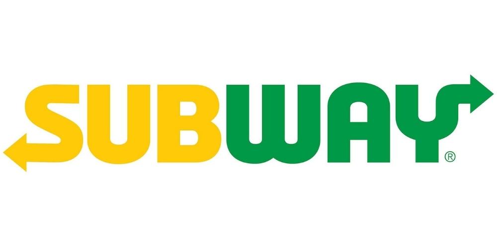
There is no need to go overboard with your logo design. Designate two or three key attributes that you want to be represented in your brand and then try to find a simple way to combine them into a sleek design. For example, the Subway logo very simply displays its name with two arrows coming out of the letters on each end. These arrows are meant to symbolize that you can grab your food quickly and on the way to where you are going. The arrows symbolize you coming in and out of the store in a simple, flowing manner.

Whenever you think you have developed a simplistic logo, I suggest putting it through what I call The Glance Test to see if it passes. Show a friend your logo and let them look at it for 10 seconds. Take the logo away and give them around a minute break. If your logo was designed in a simple enough manner, your friend should be able to recreate your logo with paper and a pencil after this minute of being exposed to your logo. Their drawing doesn’t have to be a masterpiece, but it should be recognizable. Logos that pass this test are more likely to withstand the test of time.
2. UNIQUE
When designing logos, it is important to research your competitors both inside and outside of your industry. This can help you in two ways. The first is you will be able to pick up on patterns and design similarities common to successful brands in your sector. For example, in the tool industry, you will find many logos with big, bold fonts. This is because the bold fonts symbolize toughness and strength, which is in-line with the brand identities.

If you see a lot of logo similarities in a particular market, it is smart to try and figure out why that is the case. You don’t have to follow the trend, but recognize what is being done and why.
The second reason competitor research is important is because it will allow you to see what logos are already being used. Creating a brand identity is already hard enough. Having a logo similar to one of your competitors will make the journey even more difficult. Make sure your logo design is unique to your business.
3. Versatile
Your logo design is going to become the face of your brand. You need to make sure it can go anywhere. It needs to be versatile enough to be displayed in a large context, such as a billboard, or in a small context, like a business card. (This is one reason having a vector version of your logo is so important. More to come on this in a separate post.)
Your logo should also be versatile in structure. Meaning you should have different variations of your logo design that will fit in a variety of areas. Ex: Horizontal Logo for letterheads and stationery, Stacked Logo for Packaging on small objects, Vertical logos for vertical banners, Badge logos for promotional stickers. The list could go on and on. The takeaway is that your logo should be able to evolve into different shapes while remaining easily recognizable.
4. Timeless
When creating a logo, it is tempting to go along with trends of what is popular at the time. For example, when the chevron pattern was trending, everyone wanted it in their logos. Leaves became popular a couple of years ago, and everyone wanted a leaf in their logo.
Including trends in your logo is okay if it is truly fitting to your brand and will remain a constant to your brand identity. However, if this is not the case, following trends with your logo design is going to result in a lot of extra time and money that you will have to spend rebranding every couple of years.
It is best practice to design logos that will stand the test of time. They should include timeless fonts and elements.
You can still have fun with trends, but save the trends for other areas of your brand that can evolve with time to stay fresh.
5. Appropriate
To create an appropriate logo, ask yourself these two key questions:
- Does this fit in with the brand identity I am trying to build?
- Will this appeal to my ideal customer?
If you can answer “Yes” to these two questions, your logo will be more effective.
When answering the first question, think about what feelings you want your brand to evoke. If you want it to feel welcoming and united, you might want to include circle elements in your logo design. If you want your brand to be more structured and rigid, squares and rectangles might be the more appropriate route for you to take. Color theory is a whole different topic, but the colors used in your brand should also be cohesive with your brand identity.
When answering the second question, you should step out of your shoes and try to think about how your ideal customer will view your logo. You might think something looks good, but will they? Will they be able to pick up on the symbolism displayed in your logo design? Putting yourself in your customer’s frame of mind will help you design a logo that will be appealing to them.
Wrap Up:
If you focus on these five logo design principles, you will be able to develop a more effective logo that will help you build a strong brand for years to come. If you have any questions, feel free to reach out!
Upward and Onward,

Bailey Thibodeaux
Founder of Honeywave Creative


