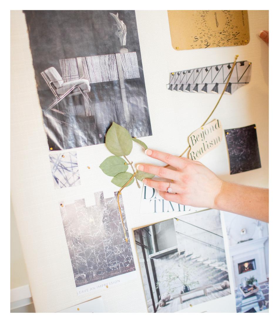
Pictures are one of the most important aspects of your website besides the actual content that is being discussed. You want the pictures on your website to be cohesive with your branding and to give a professional feel that aligns with the rest of your marketing.
For example, if you have a bright, colorful brand with playful fonts and colors, you would want to have brand imagery that pulls in those bright colors and displays the fun personality you want to communicate. You would NOT want to include dark, gloomy pictures on your site that don’t match the vibe of your brand. It would create a stark contrast that will confuse your visitors.
Likewise, if you have a minimal, clean aesthetic, you wouldn’t want to bring in super bright, colorful pictures. The two don’t jive well with each other.
Now, how do you go about getting amazing pictures for your website? You can always take pictures on your phone by yourself or with a friend, but if it fits in the budget, I highly recommend hiring a photographer to professionally capture your brand’s essence. You also have the option of using stock images that you find online, although this is not the route we recommend.
With that being said, let’s go over a few ways you can get proper, website-worthy pictures to draw in your clients and create a professional and cohesive feel for your site:
Stock Images:
The first route you can take to gather website pictures is by finding stock images online. Though this is not our top recommendation, it can do the trick if you are looking for a lower-cost alternative to hiring a professional photographer.
To find good stock photos you can go on websites like Pexels, Behance, Kaboom, or Canva. All of these websites have tons of amazing free stock images covering just about any topic.
Oftentimes, if you find an image you like, you can click on the profile of whoever posted it to find other pictures from the same shoot that will pair nicely with the one you have selected.
_________
If stock isn’t the route for you, consider hiring a professional photographer or having a photoshoot of your own. You can go online and find local photographers in pretty much any area and at any price point. Make sure the photographer you choose has an editing style that will match your branding. You can ask them for a portfolio before making your decision to see the type of editing style they typically use.
We always suggest having your own photoshoot over using stock images, because they allow your brand’s unique spirit and personality to shine through. If you are a personal brand, it will also allow you to show your face to potential clients and help build that trust with them even through a computer screen.
Hiring a Professional Photographer:
If you decide having a photoshoot is the right direction for you and your website, let’s review a few things to help prepare you to make sure you come out of it with pictures you LOVE!
Location:
The location you choose for your photoshoot plays a huge role in how your pictures turn out. You want to select a location that matches your brand vibe.
For example, if your brand has an editorial feel to it, you may want to get some shots in the city streets or a high-rise room with floor-to-ceiling windows and a cityscape behind you. You wouldn’t want to go out in the country to a farmhouse taking pictures with the cows.
Try and find a few locations in your area, or afar, that will help build out a full visual of your brand’s personality and messaging. These images will help set the tone for how your audience will perceive you across all marketing mediums.
Props:
I highly recommend gathering props before your photo shoot to bring with you to the set. It will help you come up with photo ideas during the times you may be wondering what to do with your hands. Props will also help make your images feel more lively, as they introduce more to the setting than just your pretty, smiling face. It helps create a more holistic view of your branding.
The props should be geared toward you, your brand, and your business. If you are an online coach you can use your laptop or your phone in pictures. If you’re a chef, you can bring your favorite kitchen tools and maybe some food you’ve made. Some other props you can bring are items that pull in your brand colors, any tools you use daily to run your business, notebooks, pens, plants, and any other items that would help bring your brand image to life.
Have some fun with this one. Brand photoshoots are meant to be fun, bold, and memorable. Don’t feel like you have to play it safe.
Outfits:
Your outfits should represent your brand just as much as the location and props. And yes I said OUTFITS-plural. I recommend having 2 or 3 outfit changes to help create some variety in your images and make it look like they were captured on different days and in different settings.
Plan out your outfits to compliment your brand colors. If you have a brand filled with blues, greens, and yellows, then you shouldn’t be wearing red to your photoshoot. Take your brand colors with you when you go shopping to make sure your outfits match perfectly with the other colors that will be used on your website.
Another thing to keep in mind is how you want to be perceived by your audience. If you want to be seen as a corporate professional, you should wear a suit in at least some, if not all, of the pictures. If you want to be seen as more laid back and down to earth, you can dress down with jeans and blouses.
You can also do a variety of outfits to show off different sides of your personality. You can have one super professional outfit, another that is more middle-ground as far as professionalism goes, and a third that is more on the comfortable side for when you are having relaxed conversations with your audience.
Now that all of that is figured out, let’s go over a few of the different pictures you’ll want to capture for plenty of variety on your website.
Types of Pictures Needed:
Your future self will thank you if you capture a wide variety of images during your photoshoot. A website always looks so much better if you have a mixture of brand images to use throughout, including portrait, landscape, pictures of you, pictures of objects, and pictures of sceneries.
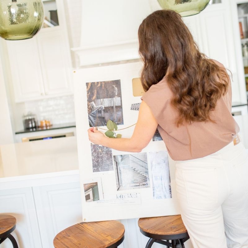
Some of our favorite images to use on websites are flatlays. Flatlays are overhead pictures of props that are great to use for backgrounds. To create this type of image, set out a “work area” of things you use often in your business. This can be papers, electronics, fabric pieces, kitchen utensils, etc. Take a few pictures from above, and then move the props around to get some different image varieties. You can also capture some pictures that include your hands in motion reaching to grab items from the workspace. These add a subtle hint of energy and life to photos and your website.
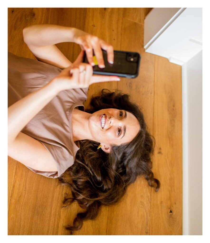
Headshots are a must. These are close-up images of you looking directly into the camera. These are good for About Pages and Bio Sections. You can take several different headshots in the locations and outfits of your choice. A fun idea for this one is to take a couple of headshot images with slight variations to them so that you can combine them into a gif format on your website. You can also take landscape images of yourself where you are centered off to one side of the screen. These are handy on websites where you want to have yourself positioned on one side of the screen with wording on the other.
The next pictures we recommend taking are working pictures. These are pictures of you doing what you do best! This can be you on calls via Zoom or phone, typing away on your laptop, making/packaging your products, etc. These are always good to have for use on your Services Pages when you’re talking about your offers.
Background-oriented pictures. These are images that are specifically captured to be used in background settings on your website and other marketing materials. They don’t have too much going on. Usually, they are rather simple. However, they are good for setting the scene and delivering your content in an impactful way. For this, you can simply take pictures of your photoshoot location both with people and without. You can also do some images where your products are lined up or used in the background so that they are incorporated naturally. These images are super versatile to use when marketing.
The last picture type we’ll discuss is lifestyle pictures. These are great to use on your About or Home Page. These can be pictures of you hanging out on a couch, spending time with family, doing some hobbies you love, or anything you like. It’s always nice to have a break from strictly business with your pictures. It allows your clients to see more of the person behind the business and to relate to you on a deeper level.
____________
Whew! That was a lot!
Let’s wrap it up and go over what we just discussed.
When it comes to the pictures on your website, decide if you want to use stock, professional photography, or a mix.
If you decide to go with professional photography, make sure to hire a photographer that has an editing style that aligns with your brand. From there, you can find some good locations, outfits, and props to bring your images to life. When your photo shoot day arrives, make sure to capture a wide variety of images so that you aren’t limited when you start designing.
Oh and one last thing…Have fun with it!
Our favorite part of the website design here at Honeywave Creative is getting to see your bright personality shine through with your brand images and finding ways to bring that to life even further with your website design.
If you’re interested in working with us to help bring your new brand images into your website design, check out our One Day Website offer. You can get more info on what is included with that package here.
Written by Kyle Miller
Executive Design Assistant


