
If you own a small business and you have ever stared at your website wondering whether it is actually doing anything for you, the honest answer is probably no. Most small business websites are pretty. Some are even on-brand. Very few are built to convert.
Website design for small business is not just about fonts and color palettes. It is about turning a stranger into a confident buyer through clarity, strategy, and a smooth path from headline to “yes.” That is the bar. Anything below it is decoration.
This guide is for the small business owner who is past the basics. You do not need a tutorial on what a homepage is. You need to know what makes a website worth the investment, what kills conversions, and how to make better decisions whether you DIY it or hire a designer.
Here is how I would approach it after 500+ websites and 120+ five-star Google reviews.
What Website Design for Small Business Actually Means
Real talk: most “small business website design” content treats the site like a brochure. Add some photos. Pick a font. Slap on a contact form. Done.
That mindset is exactly why so many small business owners feel like their website is invisible.
A small business website is a salesperson. It works around the clock, in front of people who might never get on a call with you.
Its job is to:
- Tell visitors exactly what you do, who it is for, and why you are the right fit.
- Walk them through the same buying logic you would use if you were sitting across the table.
- Make the next step (book, buy, inquire) feel obvious instead of optional.
If your site is not doing those things, the design is failing the strategy. And that gets expensive fast, because the cost of a website that does not convert is rarely the build fee. It is the leads that never converted while the site sat there looking nice.
The 5 Things Every Small Business Website Has to Do
Before you redesign anything, run your current site through this list. If it is missing any of these, you have your priority order.
1. Answer who you serve and what you sell within 5 seconds of landing. Vague headlines lose people. Confused visitors leave. Your headline should make a specific reader say “this is for me” the second the page loads.
2. Show pricing or a clear pricing range. This is the single most common mistake I see, and it is so important I gave it its own section below.
3. Have a clean, fast mobile experience. Over half of your traffic is on a phone. If your mobile site is laggy, cramped, or broken, you are losing leads before they even read your offer. Test your site on the phone you actually use, not the desktop preview.
4. Make the call to action impossible to miss. One primary CTA per page, repeated, in a button color that pops against the rest of the design. If the visitor has to hunt for the button, you have already lost them.
5. Build trust quickly. Reviews, real photos of you, results from past clients, anything that signals “I am a real human and I deliver.” A small business site without trust signals is a stranger asking for money. People do not give money to strangers.
That is the floor. Not the ceiling.
The 3 Mistakes That Are Killing Your Conversions
After looking at hundreds of small business sites, the same three problems show up over and over. Fix these before you fuss with anything else.
1. Hiding pricing
This one drives me up a wall.
If a visitor cannot tell whether you cost $500 or $50,000, they will leave and find someone who does tell them. They are not going to fill out a form, get on a discovery call, and sit through a pitch just to find out the number. Your competitors who are upfront with pricing will eat your leads.
The fix: put a starting price, a range, or “most clients invest between X and Y” on your services or pricing page. You do not have to publish a full menu. You just have to give people enough info to self-qualify before they reach out. The visitors who would have ghosted at the price will ghost on the page instead, which is a feature, not a bug. The ones who do reach out are warmer, faster to close, and far less price-sensitive.
2. Long contact forms and applications
A 12-field application form to start a conversation is a conversion killer. By the time a prospect gets to “What is your annual revenue?” and “When do you need this completed by?” most of them have closed the tab.
The fix: name, email, message. That is the floor for an inquiry form. Capture the lead. Follow up over email if you need more info. If something can be a direct purchase with no call required, let people buy. Tools like Dubsado public forms, Stripe checkout, Kajabi, and ThriveCart make a no-call buying flow simple.
The longer your form, the lower your conversion rate. Period. Cut every field that is not essential to the very first reply you would send back.
3. Too much stuff on the website
Every old offer, abandoned lead magnet, and “just in case” service page on your site is a tax on your conversions. Hick’s Law (more options means slower decisions and more drop-off) is real.
The fix: cut anything that is not actively converting. Lead with the one thing you most want visitors to buy or do. If a page has not earned its place in the last 90 days, kill it. Your services menu does not need every offer you have ever sold. Your homepage does not need three competing CTAs. Your nav bar does not need a link to the Substack you abandoned in 2023.
A clean site is a confident site. And confidence sells.
Strategy Before Aesthetics
Here is the line that runs underneath everything I do: strategy matters with the website. It is not just what it looks like. It is the strategy infused into everything.
That sounds abstract until you see it on the page. So here is what it actually looks like.
Bright button colors. Your CTA buttons should not blend into the design. They should jump. A visitor scanning your site for 4 seconds should know exactly where to click without having to slow down and read.
Hover effects on buttons. A small color shift, a subtle scale, a quiet shadow. It is a tiny dopamine spike before the click, and it makes the click measurably more likely.
Picture direction. People in your hero images should face into the content, not away from it. Visitors’ eyes follow the eyes in the photo. Use that to direct attention toward your headline and your CTA, not toward the edge of the screen.
Simple design in your highest-priority CTA sections. When you are asking for the conversion, strip distractions. No competing buttons, no unrelated graphics, no busy backgrounds. Whitespace is doing the same job a quiet voice does in a noisy room.
Conversion-driven copy structure. Pretty design wrapped around weak copy still loses. The structure of the page (headline, subhead, value, proof, CTA) has to do the heavy lifting before any color swatch matters. At Honeywave, every client gets a Content Writing Guide that walks them through the conversion structure before a single design decision happens. That is not a coincidence. That is the order it has to go in.
This is what separates a strategic website from a pretty placeholder. The visitor who has never heard of you walks in cold and walks out a confident buyer because you laid out the right info in the right order.
WordPress, Shopify, or Squarespace? Pick Based on Business Model, Not Vibes
I get this question every week, so let me make it simple.
If you are primarily a service business (coaching, consulting, agency, therapy, contractor, photography, almost anyone billing for time or expertise), I recommend WordPress. More design control. More flexibility. Cheaper than Squarespace. Paired with Elementor as the page builder, your site looks high-end and stays editable by you, no walls of code required.
If you are primarily an e-commerce business with regular order fulfillment, Shopify wins. Built-in fulfillment, a smoother buying experience, and far better infrastructure for serious online retail. WordPress plus WooCommerce can run a store, but it is clunkier than Shopify for a serious e-commerce operation.
If you are a service business with one or two products (an ebook, a digital download, a small kit), WordPress plus a Stripe checkout, ThriveCart, or a drop-ship checkout setup gives you the best of both worlds. You do not need the overhead of a full Shopify store for two products.
Squarespace is fine if you are DIY-ing a basic site to start. The moment you hire a designer, WordPress is almost always the better call. Customizing Squarespace requires a wall of code, which means you cannot easily update your own site after launch. WordPress with Elementor avoids that trap entirely. We covered the full breakdown in WordPress vs Squarespace: An Honest Comparison.
DIY or Hire a Designer? An Honest Framework
Not every small business needs a custom website right now. Here is the honest read.
DIY makes sense when:
- You are testing an offer and you do not yet know if the market wants it.
- Your budget is genuinely tight (under $1K available for the full project).
- You have the time and patience to learn the platform.
- You are okay with “good enough” while you grow into something better.
Hire a designer when:
- Your offer is validated and you are losing leads to your current site.
- Your time is worth more than the hours a DIY build will eat from you.
- You want a site that converts, not just a site that exists.
- You are ready to invest in the strategy, not just the visuals.
The most expensive mistake in this entire conversation is rarely the design fee. It is paying for a site that does not convert. A $500 template that brings in zero leads costs more than a strategic build that turns into $30K of revenue in six months. Run the math on what one extra signed client a month would mean for your business, then decide.
How a Real Web Design Project Should Actually Run
This part matters more than most small business owners realize. The reason most projects drag on for months is not the design. It is the lack of process behind it.
Most agencies have no system. They book the project, then scramble, then the timeline slips, then the client gets vague updates, then six months later the site finally launches and everyone is exhausted. A website in a day is not possible without a real process. It is possible because of one.
After 500+ websites and 120+ five-star Google reviews, the structure I rely on is built around four phases (onboarding, prep, build, offboarding), and each one prevents bottlenecks in the next.
Onboarding. The moment the contract is signed, you get a project board with an onboarding video. Tone is set. Expectations are clear. You know exactly what is happening next.
Prep. You write your conversion-driven copy using a Content Writing Guide that gives you the structure most owners are missing. No staring at a blank Google Doc. The prep ends with a call to make sure everything is locked in before design day.
Build. Design day. The site gets built, and the last 2 hours of the day are reserved for revisions. Live by end of day.
Offboarding. A two-week follow-up support window for functionality fixes (broken buttons, mobile display issues), plus access to a training video library so you actually know how to update the site you just paid for.
Whether you hire Honeywave or someone else, ask the question: “What is your process?” If the designer cannot answer in three sentences, that is your sign. The smooth project and the stressful project are usually separated by process, not talent. You can see how this plays out in real client work on the Honeywave portfolio.
What to Look for in a Small Business Web Designer
Skip the dazzling reel for a second. Ask these questions instead.
- What is your process from kickoff to launch?
- How do you handle copy and content? (Are they writing it, are you writing it, do they have a structure to give you?)
- What happens if I want to update something six months from now?
- Can I see a portfolio of similar sites you have created?
The portfolio matters. Of course it matters. But process and post-launch flexibility matter more for your long-term outcome. A great-looking site you cannot maintain is a sunk cost. A great-looking site that does not convert is an even more expensive sunk cost.
A good designer will also have a clear opinion. If they recommend whatever platform you mention first, that is a yellow flag. You want someone with a position, not a yes-person with a portfolio.
Your Next Step
If your current site is not pulling its weight, you have two real options.
Option one: Keep what you have, fix the three biggest conversion leaks (pricing visibility, lead capture form length, and clutter), and revisit in 60 days. This is the lowest-risk move for a business that is still validating the offer.
Option two: Invest in a strategic build that is designed around how small business owners actually convert. Not a template. Not a “we will throw something together” agency engagement. A site with the structure, copy, and design strategy to do the selling for you while you focus on the work you actually love.
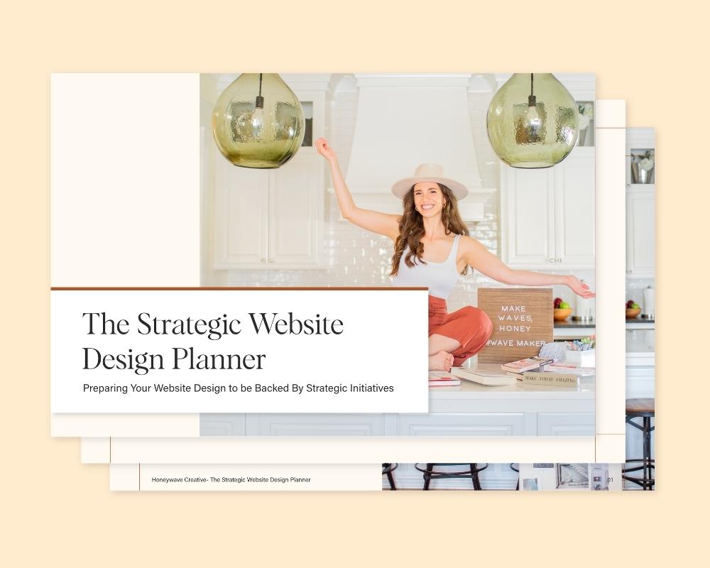
Either way, start with clarity. Grab the Strategic Website Planner and use it as the foundation for whatever you build next, and will help you map out the overall structure for your website.
Your website should be your hardest-working employee. Let us help you get it there with our One Day Website Package!