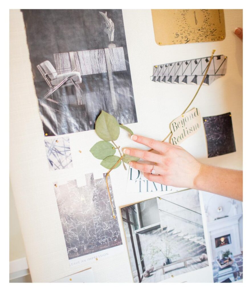
When we build out our brands, we always ask that our clients provide us with a Pinterest board to set the scene before going into it blindly. This helps our brand design days go as smoothly as possible and prevents further back-and-forth on things like colors and aesthetic. Creating a mood board of example brands you like helps you to clearly articulate all of the ideas that are swirling around in your mind in a visual way for others.
When making your Pinterest Board, think about your business. Consider your current branding and what you like/don’t like about it. You can also look at other businesses in your niche or area and see what it is about their branding that works or doesn’t work. Lastly, think about how you want to be perceived by your audience. With all of these things in mind, you will have a better idea of your desired branding and make it easier to create your board.
Now let’s cover the types of items that should be included in your Pinterest board.
Aesthetic Pictures:
The first things we ask for, and likely the easiest to find on Pinterest, are aesthetic pictures. To start, just look around on the homepage. Find a few pictures you like that you think would be a good vibe to base your branding around. This could be landscapes, architecture, interior designs, and so on.
Pro-tip: if you look at the recommended images under one of the pictures you click on, there are always similar pictures underneath and eventually you can just go down a rabbit hole of vibey pictures for your brand! Add all of the pictures you like to your board and then continue searching. These will be the cornerstones of your branding. It will allow your designers to get a feel for the aesthetic direction you are wanting to go in. These images also help set the tone for your brand’s color palette.
Textures:
After you get a few aesthetic pictures added in, try finding some textures that you like. These are things that would go well as backgrounds or overlays on websites, business cards or posts.
For example, if you want a brand with a Western aesthetic, you can add in some leathers or cowhides. If you’re wanting a sophisticated and elegant brand, look for some marble or silk textures.
Textures are good fillers for backgrounds when a solid color would be too boring and a full picture would be too busy. They also help to create visual interest in your designs so that it pops off of the screen and doesn’t feel so flat.
Logo Designs:
Now that those are out of the way, let’s look for some logo designs.
Your logo is one of, if not the, most important part of your branding. It’s how people know you and your brand. You want something that is going to stick with people.
With that, what kind of logos do you like?
If you like more simple logos you can use keywords like “simple” or “minimal” in your search. Some examples of these are Apple, Nike, and Chanel. If you like more out there and complex logos you can try searching for “bold” or “edgy” logos, something akin to MTV or Starbucks.
Another suggestion: Try looking for logos both in your niche AND outside of it. If you run a dog grooming business, you can look up what other dog grooming businesses are doing for their brands. You can also look up what businesses outside of your niche are doing. Looking outside of your specific industry will help you stand out from everyone else and create something unique and memorable.
Fonts:
On a similar note, you’ll want to find examples of fonts that you like. If you don’t have a background in design, this can sound like a fairly daunting task, but trust me, it’s a lot easier than it sounds.
Similar to logos, you can search for fonts by using words such as fun, bold, edgy, etc., but I’ll give you a few designer vocabulary words to help you out.
For the more traditional, elegant fonts, you’ll want to look up Serif Fonts. Those are the ones with exaggerated corners or “serifs.” These include Times New Roman, Georgia, Garamond and so on. If you want a more clean, minimal look, then you’re probably in the market for a Sans Serif. These are the fonts with non-exaggerated corners, or to put it frankly, fonts without serifs. Some popular sans serifs are Futura, Helvetica, Proxima Nova and a ton of others. Script is a word you can use to find cursive or handwritten fonts, these are good for making your brand feel more human or relatable.
You can even circle back and use these terms to look for “Serif Logos” or “Sans Serif Logos” to find more logos that align with what you want. You’ll be surprised how many Script Logos are on Pinterest.
Mockups:
Some of the less crucial – but still extremely helpful – things we typically ask people to include in their Pinterest Boards are mockups. These include things like business card designs, flatlay examples, social media templates, etc. And, if you just so happen to be getting your website built with us also, you can add in some website pages that resonate with you. These posts, once again, will help you communicate your vision more clearly so the design is executed in a way that both matches your vision and appeals to your target audience.
And You’re Done!
Once you have all of these included in your Pinterest board, you can now rest assured that your brand is off to an amazing start! As long as you have a well-rounded Pinterest board, it makes the task of designing your brand much easier.
If you want to sit back and relax while we take over the reins of your rebranding journey, check out our One Day Brand package. With this package, you get a completely custom new brand with all of the bells and whistles included, built in a day. It’s pure magic! You can get more info on this offer here.
Written by Kyle Miller
Executive Design Assistant

