A Shopify case study for Berkley Sweetapple’s The Business Studio
If you’ve ever wondered whether a website redesign actually makes a difference, this case study answers that question clearly.
When Berkley Sweetapple came to us at Honeywave Creative, she already had traction. Her business was growing, her audience was paying attention, and her marketing was driving consistent traffic. The missing piece wasn’t demand. It was conversion.
Her website looked good, but it wasn’t supporting the way customers actually move through a buying decision. Visitors were browsing, hesitating, and leaving before checkout. So we rebuilt the site with one goal in mind: turn existing traffic into consistent revenue.
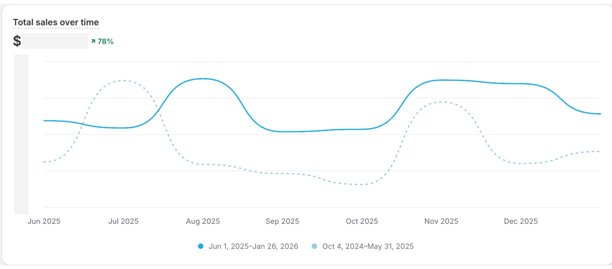
Total sales increased by 78% after launch, with stronger consistency across the second half of the year.
The Starting Point
Before the redesign, Berkley’s website was quietly leaking sales. Traffic from Instagram, email, search, and referrals was landing on the site, but too many visitors were dropping off before completing a purchase. Add‑to‑cart rates were inconsistent, checkout completion was lower than expected, and marketing efforts weren’t compounding month over month.
In short, the site wasn’t broken, but it wasn’t working as hard as it could. And that’s often the most expensive place for a business to be.
The Goal of the Redesign
This project was never about a visual refresh. It was about building a website that could function as infrastructure for growth.
That meant simplifying the buying journey, removing friction at key decision points, and designing every page around buyer behavior instead of assumptions. We wanted the site to support Berkley’s marketing instead of fighting it and to make purchasing feel obvious, easy, and safe.
Every decision came back to one guiding question: what does the customer need to see next to confidently move forward?
The Strategy We Used
Instead of designing pages in isolation, we rebuilt the entire customer journey from entry point to checkout. Product pages were restructured to create clearer hierarchy and flow. Navigation was simplified to reduce overwhelm. Trust signals were intentionally placed at moments of hesitation, especially near checkout. Mobile optimization was treated as a priority, not an afterthought, since the majority of traffic was coming from social.
The end result was a site that guided customers instead of asking them to figure things out on their own.
The Results
The difference became visible almost immediately after launch.
Conversion Rate Growth
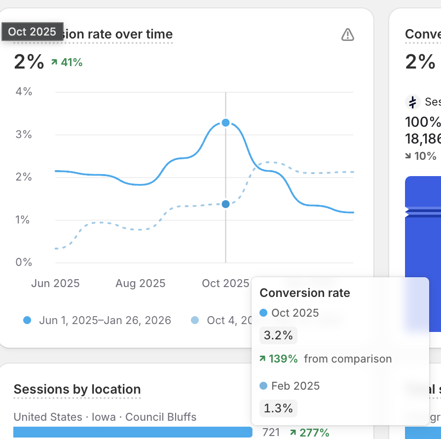
Conversion rate climbed steadily after launch, peaking at 3.2% in October.
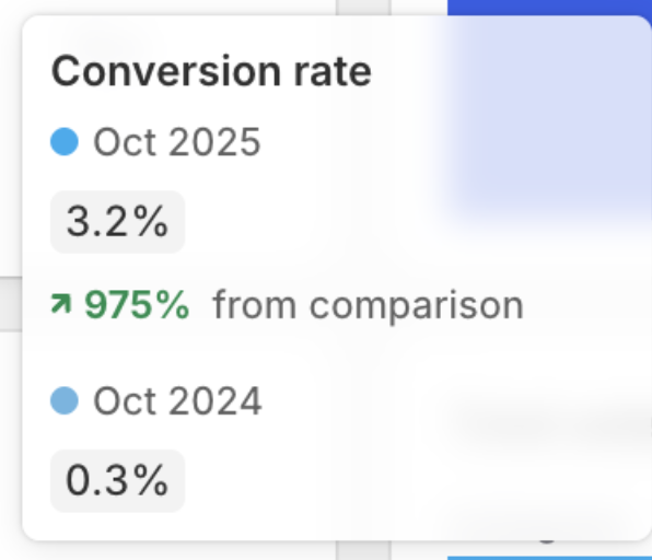
October conversion rate increased from 0.3% to 3.2%
After the new website launched in June, overall conversion rate increased to an average of 1.9%, with the site peaking at 3.2% in October, up from just 0.3% in the comparison period. That shift alone meant the same traffic was suddenly producing significantly more buyers without increasing ad spend or content output.
This is one of the clearest indicators that the site itself was doing the heavy lifting.
A Healthier Buying Funnel
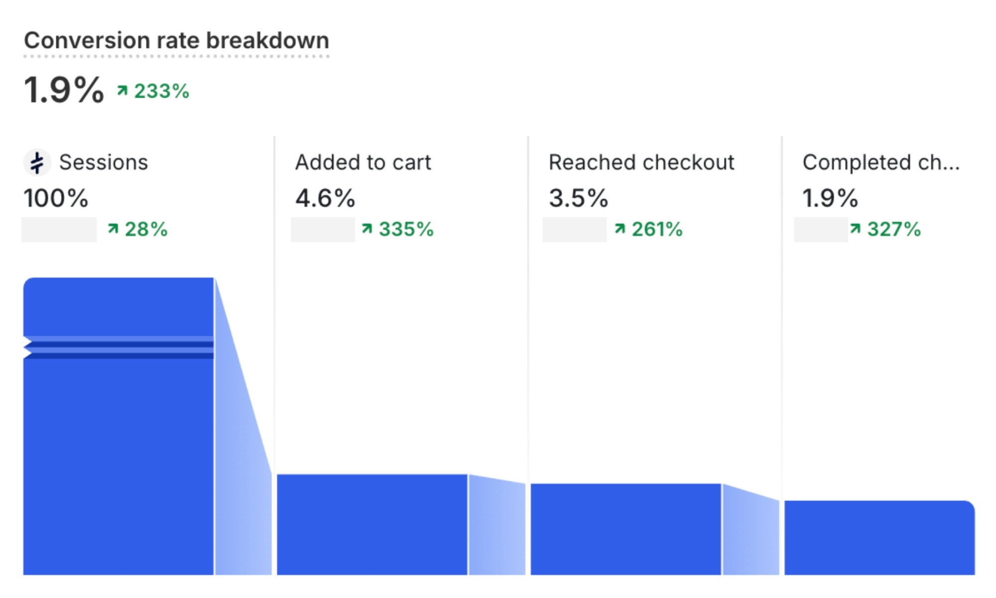
More visitors moved successfully from product view to completed checkout.
Once friction was removed from the experience, customers started moving through the site with more confidence. Add‑to‑cart actions increased by 335%, checkout reach increased by 261%, and completed purchases increased by 327%.
Those numbers tell a simple story: customers weren’t confused anymore. They knew what to do next, and they followed through.
Revenue Growth
Looking at the correct timeline from January through December, the results are even clearer. Following the redesign, total sales increased by 78% compared to the previous comparison period, with especially strong performance in late summer and Q4. More importantly, the site showed stronger consistency month over month, creating a more predictable revenue pattern rather than isolated spikes.
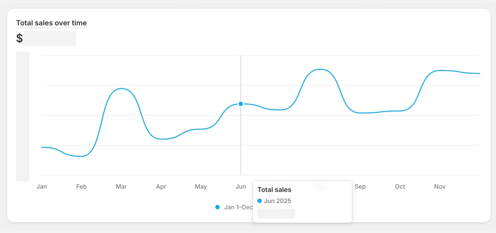
Revenue stabilized and grew steadily throughout the second half of the year.
Instead of relying on sporadic spikes, revenue stabilized and grew more predictably through the second half of the year, which is exactly what we want to see when a website is supporting the business instead of holding it back.
Marketing Performance After the Redesign
With the new site in place, Berkley’s marketing channels finally had a strong foundation to convert on. Traffic from Instagram, email, search, and Facebook landed on pages that were built to guide decisions instead of create friction.
This is why we saw clear improvements across channels without needing to overhaul her marketing strategy. The site itself did the heavy lifting, turning attention into action.
Order Volume
Across the full year following the redesign, Berkley’s store processed 779 total orders, nearly doubling the previous year’s volume. More importantly, this increase aligned with the improved conversion rate and stronger checkout completion we saw throughout the funnel.
This confirmed that the growth wasn’t simply driven by more traffic, but by a better customer experience that encouraged more visitors to complete their purchase.
A Note on Average Order Value
One of the most interesting trends after launch was the increase in average order value over time. As the site experience improved, customers began purchasing higher-value orders, with AOV steadily rising throughout the second half of the year and peaking during Q4.
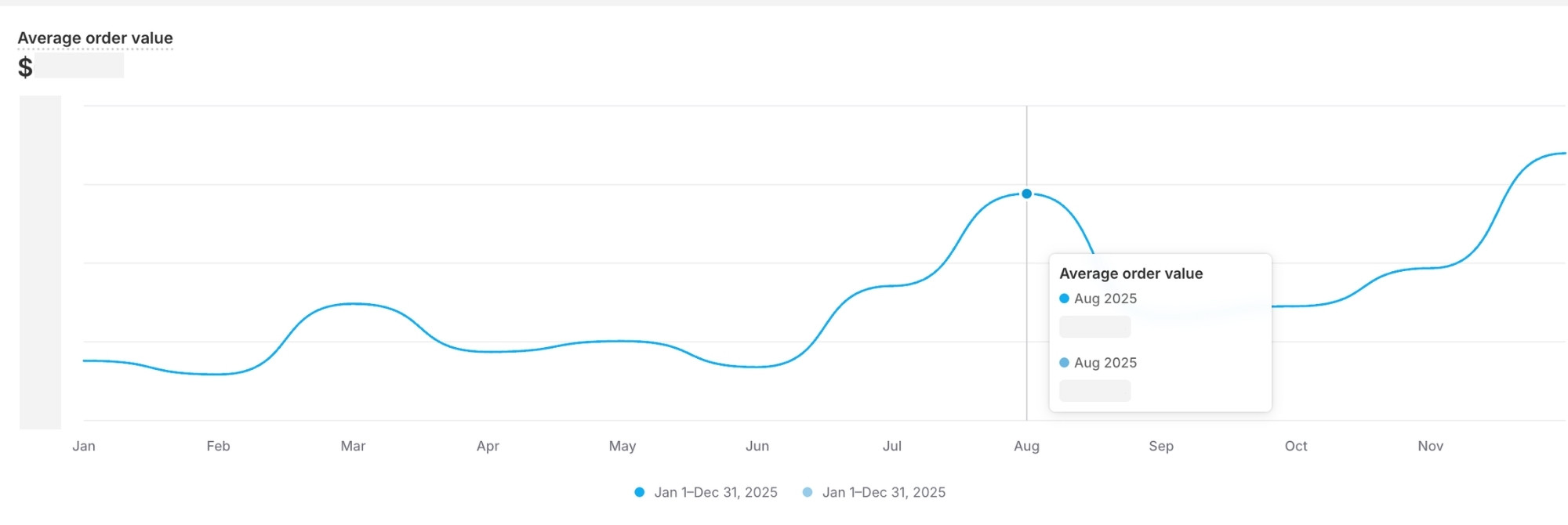
Average order value more than doubled after launch and continued climbing into Q4.
This is a strong indicator of increased buyer confidence. When customers trust the experience, they buy more at once.
Why This Worked
Websites don’t make money because they’re beautiful. They make money because they remove friction, build trust, and guide buyers forward with clarity.
This site was designed as a system, not a static brochure. Each page supported the next step, and every element served a purpose in the buying journey.
The Takeaway
Berkley didn’t need more traffic. She needed a website that respected the traffic she already had.
Once the site started doing its job, everything else began working better too.
Want Results Like This?
At Honeywave Creative, we build conversion‑focused websites in one day that support real business growth.
If you’re ready for a website that works as hard as you do, you can learn more about our One Day Website experience here.