
Pretty websites lose money every day. Beautiful design without strategy behind it is one of the most common (and most expensive) mistakes I see on service-based business websites, and it’s almost always the reason a site that gets compliments isn’t getting clients.
The honest answer is that strategic website design is the difference between a site visitors admire and a site that books work. It’s not an aesthetic choice. It’s the structural decision-making that happens before, during, and after the design process. The choices about what to say, where to say it, what to put first, what to leave out, and how to guide a stranger from “never heard of you” to a confident buying decision.
In this post I’ll walk you through what strategic website design actually means, the quiet mistakes that kill conversion on otherwise beautiful sites, the specific design moves that make a strategic site work harder than a pretty one, and how to plan for strategy BEFORE you fall in love with a moodboard. I’ll also share a free planning tool you can use to think through your own site without hiring anyone, plus how I think about the strategy-meets-aesthetics question on every project I take on. If you’ve ever looked at your own website and thought “this looks great but it’s not booking calls,” this is for you.
What strategic website design actually means
Strategic website design means every visual, structural, and copy decision on your site is in service of a specific business outcome. Not a vibe. Not a portfolio piece. An outcome.
That outcome is usually one of three things: a booking, a purchase, or a captured lead. Sometimes it’s a softer goal, like building enough trust that a stranger remembers you when they’re ready to buy six months from now. Either way, strategy is what connects “here’s a website” to “here’s a website that grows the business.”
Pretty design alone does not do that. I’ll say it warmly because I’m a designer first and I love a beautiful site, but a website can win design awards and still let leads slip through every single day. The two most expensive websites I’ve reviewed in the last year were both gorgeous, both had clear visual identities, and neither was converting. Both were missing the strategic layer underneath the visuals.
Most generic web design content treats strategy and aesthetics like two separate conversations, which is part of why this misunderstanding is so widespread. They aren’t separate. The strategic decisions show up in the visuals. That’s the whole point of what we do. When someone says “strategic website design,” what they really mean is design that’s been engineered to make a visitor’s path from question to decision as short and clear as possible, while still looking like a brand worth trusting.
The conviction I build every Honeywave site on is this: strategy isn’t something you bolt onto a pretty website at the end. It’s the foundation underneath the pretty. It shows up in every section, every button, every photo placement, every word choice, and every page in the navigation.
The 3 things that quietly kill conversion on pretty websites
If your site looks beautiful and isn’t converting, the issue is almost never the typography or the color palette. It’s usually one of these three patterns, and I see them on websites every single week.
1. You’re hiding your pricing
This drives me a little nuts. Sites that hide prices lose leads to whoever shows them. That’s not opinion, that’s just how buying behavior works in 2026. Visitors who are already on your site comparing you against other options will leave the second they have to fill out a form to find out what something costs.
Show a starting price, a price range, or a “most clients spend between X and Y.” You don’t have to reveal everything, and you don’t have to commit to a flat number for every offer. You just have to give visitors enough information to keep them in the buying decision instead of bouncing to a competitor whose pricing was findable in two clicks.
Hidden pricing also signals something subtle and unhelpful: that the cost is going to be more than the visitor wants to deal with negotiating. Even when it isn’t. A starting price builds trust faster than a “request a quote” button ever will.
2. Your contact or application form is too long
A 12-field application form to start a conversation kills lead capture every time. Name, email, message box. That’s the bare minimum your contact form needs to capture a lead. You can follow up via email and learn the rest of what you need to know in the conversation that follows.
If something can be a direct purchase (no discovery call required), let it. Use a tool that supports that. Dubsado has nice public forms, Stripe checkout works for products, ThriveCart and Kajabi are great for digital offers and courses, and Calendly is great for any service that’s straightforward enough to book without a 30-minute call. The point is not to gatekeep your offer behind a long application when the visitor is already ready to buy.
I’ve seen long forms cut conversion in half on sites that otherwise looked beautiful. A pretty site that lets a lead silently abandon a form is doing the opposite of what design is for.
3. You have too much stuff on the website
Old offers. Lead magnets you stopped using two years ago. Three different ways to “work with you.” Five different free downloads scattered across five different pages. Hick’s Law is a real principle in conversion design. More options means a lower probability of any single choice, which means visitors get decision fatigue and leave without doing anything.
If something on your site isn’t actively converting, or isn’t actively building toward a future conversion, strip it. Lead with the one thing you most want a visitor to buy or do. Everything else is supporting cast.
This one is hard for business owners because every offer feels important, and every page took effort to build. I get it. But every additional option you keep on the homepage is a tax on the conversion of the option you actually need visitors to take.
The strategic design moves that change how visitors decide
This is the part of strategic website design that gets glossed over in most “design with strategy” articles. Strategy isn’t just an idea you think about behind the scenes. It shows up in tiny, specific design decisions that visitors don’t consciously notice but absolutely respond to. These are the moves I make on almost every site I build.
Bright, contrasting button colors so visitors don’t miss the CTA. Sounds obvious. Skipped constantly. If the call-to-action button blends into the section behind it, you’re hoping someone notices it. Strategy doesn’t hope. Strategy makes the most important next step the easiest thing on the page to spot, even when someone is skimming.
Hover effects on every clickable button. A small color shift, a subtle scale change, a brief lift. It gives the visitor a tiny dopamine spike before they click. That micro-feedback meaningfully increases the probability of an actual click. It’s a one-time design decision that pays back forever, and it costs nothing to implement.
Picture direction in hero images. When the hero image features a person, that person should be facing into your content, not away from it. Eyes are a directional cue. Visitors instinctively follow where the model is looking. If your hero photo has someone gazing off the edge of the screen, you’re literally pointing your visitor’s attention away from your headline. Flip it. Same photo, different direction, and the entire visual flow of the page changes.
Simple design in your highest-priority CTA sections. When you really want someone to take action, strip distractions out of the section. No competing buttons, no extra graphics, no five-line subheadings. One headline, one supporting sentence, one button, one direction. The lower the cognitive load on the section that’s asking for the click, the higher the click rate.
Copy that’s been written for conversion, not for personality. Personality belongs in the about page, the captions, the blog. The buy section needs clear benefits, clear next steps, and a clear reason to act now. Most pretty websites have lovely about-page copy and confusing buy-page copy. Strategic sites flip that priority. Personality on the trust-building pages, conversion clarity on the action pages.
Visual hierarchy that matches buying priority. The most important thing on every page should be the largest, the boldest, or both. If your “book a call” button is the same visual weight as a footer link, the page is treating both with equal importance. Visitors will too.
These moves don’t require a redesign. Most of them are small tweaks that can be made to almost any existing site in a couple of hours. But cumulatively, they’re the difference between a site visitor who admires your work and a site visitor who books with you.
How to plan for strategy before you fall in love with the visuals
Most website projects go off the rails in one specific moment, which is when the business owner starts looking at moodboards and inspiration sites before they’ve made a single decision about what the site needs to actually do.
The fix is to do the strategy work first. Before any color palette, before any homepage layout, before any “I love how Studio X did their about page.” Sit down and answer the boring strategic questions, like who exactly the site is for, what one action you most want them to take, what objections they bring with them, and what proof they need to see before they trust you with a credit card or a booking.
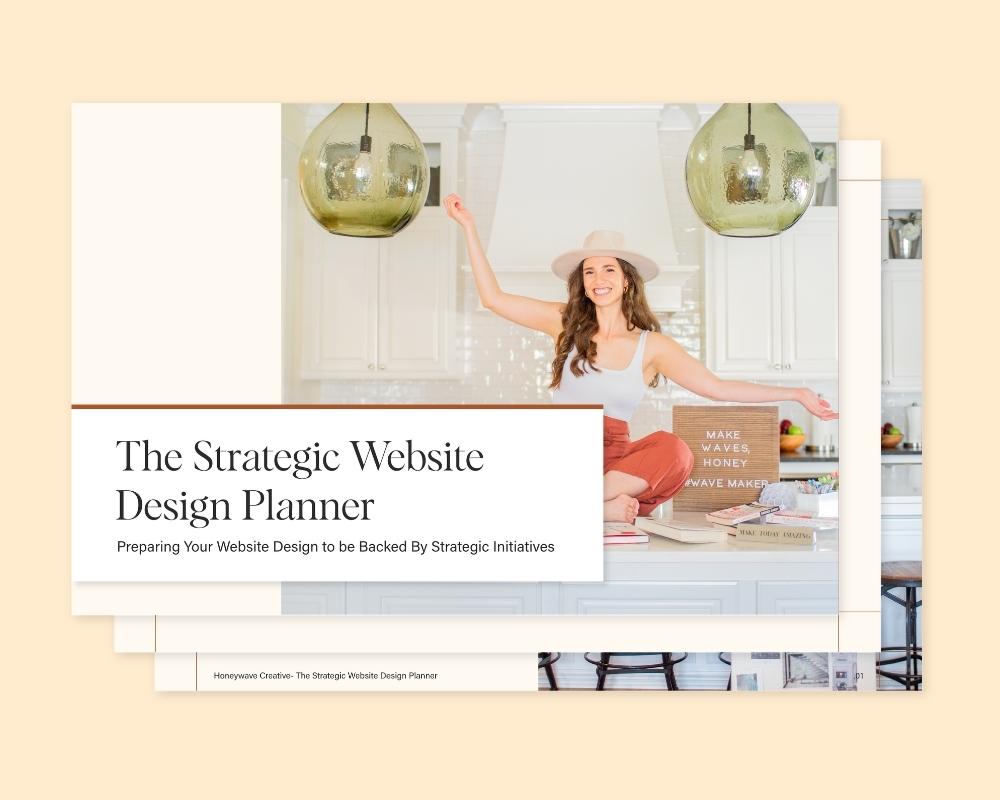
I built a free Strategic Website Planner for this reason. It walks you through the questions worth answering before you spend a dollar on design. It’s a self-serve tool, so you go through it on your own at your own pace, and it’ll either save you time on a future project or save you from making an expensive design mistake on your current one.
I recommend going through the planner before you start any website work, whether you’re hiring someone or doing it yourself. The clearer you are on what the site needs to do, the more strategic the design decisions become by default. The visuals get easier to choose, the navigation gets simpler to map, and the copy practically writes itself because you’ve already decided what each page needs to say.
If you’d rather get the planning AND the build done in 24 hours, that’s literally what we do at Honeywave with the One Day Website service. The planner is the front-end of that thinking, and it’s useful even if you never hire us.
Strategy without sacrificing the pretty
Strategic doesn’t mean ugly, and it doesn’t mean boring. I want to be clear about this because the conversion-rate-optimization world has been telling business owners for a decade that ugly websites convert better, and I just don’t think that’s true anymore. Ugly websites typically lose trust faster than they win conversions, especially for service-based businesses where the brand impression IS the buying decision.
A well-designed strategic site looks beautiful AND moves visitors toward a decision. The two are not in conflict. They reinforce each other. A site that looks polished and credible builds trust at first glance. That trust is what makes the conversion-focused decisions (the bright CTA, the simple buy section, the visible pricing) actually work.
What you want is a site that’s:
- Clean, but not boring
- Personality-driven, but not chaotic
- Strategic first, but visually strong enough that you’re proud to share the link
- Designed for the visitor’s path, not for the designer’s portfolio
When I’m building a site, I’m building both layers at the same time. The visitor doesn’t see the strategy. They feel it, in how easy the site is to navigate, how quickly they understand what you do, and how naturally the next step appears in front of them. That’s strategic website design working the way it’s supposed to.
You can see what the strategy-meets-pretty balance looks like in practice on our portfolio page. Most of those projects were built in a day. None of them sacrificed the visual brand to get there.
How to tell if your website is more pretty than strategic
Quick gut check. Open your website on your phone and answer these questions honestly:
- Within 5 seconds of landing on your homepage, is it obvious who you help and what you do?
- Is there one clear next action visible without scrolling?
- Are your prices (or a price range) findable in two clicks or fewer?
- Is your contact or booking form short enough that a busy person would actually fill it out?
- Is there one thing on every page you’d most like the visitor to do, and is that thing the easiest thing to spot?
If the answer to any of those is “no” or “I’m not sure,” there’s strategic work to do before any redesign is going to move the needle for you.
For a more thorough walk-through of what to look at, our free website audit checklist takes about 30 minutes to run and surfaces almost every conversion blocker hiding on a typical service-based business website. Pair it with the Strategic Website Planner if you’re planning a redesign, and you’ll have your action list before you ever talk to a designer.
What strategic design actually delivers
The journey on a strategic website is meant to feel inevitable from the visitor’s side. Someone who has never heard of you arrives, gets oriented in a few seconds, sees what you offer, sees that other people trust you, sees what it costs, and lands in front of a clear next step that takes very little effort to take. That’s the whole game.
Pretty matters. Trust still has to be earned at first glance, and visitors absolutely judge credibility by aesthetics. But pretty without strategy is decoration, not infrastructure. The sites that book clients, sell products, and grow businesses are the ones where strategy is infused into every visual, every structural, and every copy decision from the start.
If your current site looks great and doesn’t convert, the fix usually isn’t a prettier redesign. It’s a strategic one.
Ready to build a site that actually books clients?
If you’re ready to skip the months-long agency redesign and have a strategically designed website built and live in 24 hours, take a look at our One Day Website service. It’s our day-rate web design service that delivers a finished, conversion-focused site by end of day. Two hours of revisions are baked into the day, every strategic conversion decision is built in from the start (clear pricing, short forms, simple CTA sections, conversion-focused copy guidance), and you walk away with a real working site instead of a mood board. You can see the full process, current pricing, and recent client results on the One Day Website page.
If you’d rather get a sense of who we are and how we think first, our About page is a good place to start.
A pretty site is the cherry on top. A strategic site is the whole sundae. You deserve both.