The main goal of your website is likely to make you money. It should function as a revenue-generating tool for your business. However, solely having someone visit your website does not necessarily mean more money in your pocket. For that to happen, you need them to visit your sales page and complete an order with you.
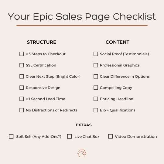
Effective sales pages have a few common features to help lead your website visitor to the desired result. This blog post outlines the different features your sales page should include with its structure, content, and additional widgets.
STRUCTURE
Less Than 3 Steps to Checkout
Your sales pages should not make it difficult for someone to give you their money. If they are finally ready to pull the trigger and make a purchase with you, you need to make sure their process is as seamless as possible. Your visitor should not have to visit more than three pages to complete their transaction. The steps to purchase should be clear and easy to follow. Doing this will help reduce the number of abandoned carts left on your website.
SSL Certification
An SSL Certification shows visitors they can trust your website as a professional business website. You can tell if a website is SSL Certified by looking at the top left address bar to find the small lock. When the padlock is present, it shows your visitor that all personal and payment information will be secure. SSL Certification adds a level of credibility to your business and will increase consumer’s trust in you.
Clear Next Step
When you have a website visitor on your sales page, you never want them to be questioning what to do next. Provide clear Call To Action buttons to lead them in the direction you want them to go. To make your CTA buttons even more effective, I suggest making them all a consistent, bright color. This bright color will draw the attention of your visitor and condition them to know the color represents the next step.
Responsive Design
Over 60% of all online searches take place on cell phones. This percentage is even higher if you are using a social media network, such as Instagram or Facebook, to drive most of your website traffic. Make sure your sales page looks good on all screen sizes, including desktop, tablet, and phone.
Less than 1 Second Load Time
Studies have shown every second of page loading delay time decreases your conversion rate by 7%. Time is crucial in serving your customer the information they need. Make sure to optimize your sales page for quick page load times. Some ways you can do this are removing animations, compressing images, and removing videos on mobile.
No Distractions or Redirects
One of the vital rules for sales page conversion metrics is to omit any link or button redirecting to another website page. Once you have a visitor on your sales page, the only place you want them going is to the checkout page. Do not distract them with any other redirects or options to pull attention away from the desired action.
CONTENT
Social Proof (Testimonials)
One of the best forms of promotion for a product or service is word of mouth advertising. People want to hear testimonials and reviews from other people like them. Sometimes your visitor may not have already gotten this type of social proof before visiting your website. It is important to include social proof on your sales page to build trust with you while the purchase decision is being made. Copy and Pasting reviews onto your sales page is an effective way to do this. An even better way to provide social proof is by screenshotting feedback and results from clients. Doing so shows viewers the testimonial was created by a real person like them. The best way to show social proof on a website is to include a video of a customer/client raving about their experience with you. Videos are the closest to word of mouth advertising you will get while the visitor is on your sales page.
Professional Graphics
Your website should display your products/services with professional, high-quality images. The more details you can show, the better. You want your visitor to know precisely what they will be getting, leaving no questions regarding the quality or features.
Clear Difference in Options
Sales pages often include more than one offer to visitors. These offers include different elements and are typically at differing price points. Make sure these options have clear differences in what they include and the value they provide.
Compelling Copy
Website copy is often overlooked. This is one of the biggest mistakes you can make on your sales page. The words on your sales page tell your client a story and lead them from visitor to customer. Your sales page copy should speak directly to your ideal customer, targeting their pain points and telling them the ways your product/service can solve them. Do not focus on the features of your offering. This is not what people care about. They care about what these features can do for them. Tell them the result. Investing in a copywriter for your sales page is a great idea.
Enticing Headline
As with the rest of your sales page copy being important, the headline of your website is perhaps the most important feature of them all. You need an enticing headline to encourage your visitor to continue scrolling and learn more. If your headline is not eye-catching and thought-provoking, you may not even convince the visitor to scroll down to your offering.
Bio + Qualifications
Take the time on your sales page to communicate to your visitor who you are and why you are qualified to provide them with what they need. This will provide your visitor with an increased level of trust in you.
EXTRAS
Soft Sell (Any Add-Ons)
Once you have an interested visitor on your sales page, be sure to include any other related offering with the original. For example, if someone is interested in buying cookies from your website, you might want to add a button at checkout for them to add milk. Another way to do this is to upsell them. If they are interested in one offer, you can persuade them to upgrade their choice at checkout to your premium, higher-priced offering.
Live Chat Box
If your business has the capacity to be responsive with a live chat box and answer visitor questions, you should add this to your sales page. Sometimes a visitor is on the edge of purchasing but has one or two questions. Allowing them to stay on the page and get answers to their concerns through a live chatbox will increase the probability their inquiry turns into a purchase. This will also allow you to pick-up on commonly asked questions and add the information to your sales page for future visitors.
Video Demonstration
Video demonstrations are another way to boost the credibility of your business. If you can demonstrate your product/service on a video, do it and include it on your sales page. It can sometimes be difficult for visitors to decipher what you are offering without a video demonstration.
If you start including these features on your sales page, I can almost guarantee you will see an increase in your online sales revenue. Crafting effective sales pages is art. It takes time to nail it down perfectly, but once you have it mastered, the money will start flowing in effortlessly.
Have you incorporated any of these on your sales page? If so, I would love to hear about your results in the comments!
Until next time friends…
Upward and Onward

Bailey Thibodeaux
Founder of Honeywave Creative

